 Adobe Community
- Home
- Muse (read-only)
- Discussions
- Error, some files on the server may be missing or ...
- Error, some files on the server may be missing or ...

Copy link to clipboard
Copied
Getting this message when I try to view my website:
"Some files on the server may be missing or incorrect. Clear browser cache and try again. If the problem persists please contact website author."
Also, the content of my website when viewed on the server is positioned completely different then the way I designed it. Things seem to shift/ overleap randomly. The mobile menu even disappears.
(see www.roosbarthels.nl)
Anyone any idea what has happend, and how to fix it?
hope so!
Love,
Ree


 1 Correct answer

I had a look at your site with a „real“ iPhone 5 and with Safari’s simulation mode. I can’t see the hamburger icon placed outside the screen:

The slight horizontal movement is caused by the misplaced message filed of your form in breakpoint 548. (this might be the culprit for the „icon issue“. (But – as I told you: I couldn’t detect this misplaced icon)
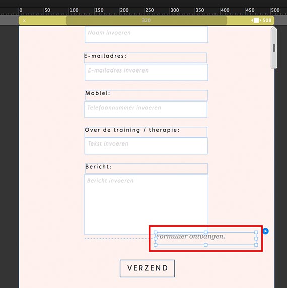
This field bleeds outside the breakpoint width and causes this horizontal shifting Place it in the middle and the shifting should be gone. Attenti
...
 10
Replies
10
10
Replies
10
Copy link to clipboard
Copied
• The wrong positioning of layout elements seems to be consequence of incorrect design decisions (pinning, resizing, …).
To assist you in this situation, do the following:
- Open your .muse file in Muse,
- Delete all pages but your master page and the „Home“ page,
- save this file under a new name, and
- upload it to dropbox, CC Files or a similar file sharing service. Then we can have a look.
• The „missing files“ alert:
How do you publish your site?
Does it happen the same way, if you publish a free, temporary website on Businesscatalyst, using the „Publish“ menu top right of Muse’s application window?
Copy link to clipboard
Copied
Hi Gunter,
Thank you for your quick reply. Below you can find the link. I am not certain if this happens due to pinning and resizing, it looks something is happening within the transition from muse to the uploaded website.
Copy link to clipboard
Copied
I had a look at your file.
Most of the issues, I am seeing on your site www.roosbarthels.nl aren’t reproducible, when I preview you site on base of your .muse file. Did you change something in your file?
Nevertheless some issues remain:
- Please place all anchors vertically aligned directly at the left edge of your page. Do this in every breakpoint. If you link to an anchor, browsers try to scroll, until the anchor is placed at the top left edge of the browser window. So, ir the anchors aren’t placed correctly, your page tends to shift, when a link to an anchor is clicked.
- There are some elements, which bleed outside the breakpoint area. Please note: No element should an no time be positioned outside/overlap the breakpoint width! Deeper information you find here: https://forums.adobe.com/docs/DOC-8953
Look at this screencast concerning your page:
You see: Especially the „Send“ message of your form and the Google maps widget are overriding the breakpoint boundaries.
So, please reposition the form message and resize the Google widget (or better resize it and make it responsive width).
As I already said: The incorrect rendering of some element on your published page aren’t reproducible, when I preview the site, which is exported from your .muse file.
You didn’t tell, how you exported your site. Did you use Muse’s built in command or a different tool?
I’d suggest, to do the following:
Publish a free, temporary test site on Businesscatalyst, using the „Publish“ menu top right in Muse’s application window. If this site works fine, use Muse’s „Upload to FTP host …“ command and choose the option to upload all files (not only the modified ones) to upload the site to your hosting provider
Copy link to clipboard
Copied
Hi Gunter,
I feel like I want to send you a massive pile of flowers, it seems to be working!
everything working fine now I have uploaded through Upload to FTP host. (was using filezilla before, with worked fine before but not anymore for some reason.)
the only problem that still occurs: the menu icon is falling off the page when viewed on a mobile device (wider then 230 pix). I still can not figure out why it does that.
Copy link to clipboard
Copied
Do you have any ideas about that one?
Copy link to clipboard
Copied
Could you tell it a little bit more precise?
Your minimal page width is set to 320 px, and that is correct. Thee are no devices smaller than 320 px.
I can’t see neither the hamburger icon (3 bars/X) nor the social media icons „falling off the page".
Can you give us a screenshot, and – excuse me! – once again an actual .muse file, because the one, you have uploaded doesn’t show this issue?
Copy link to clipboard
Copied
So if you look at the website www.roosbarthels.nl on a mobile device, the hamburger icon is not visible, it is placed just outside what you can see. It is there, but you have to swipe left to see it, and it is not in line with the rest. On a small mobile device (320pix) this is not the case, the icon is where it should be. The problem occurs on mobile devices that are slightly bigger.
many thanks
Copy link to clipboard
Copied
I had a look at your site with a „real“ iPhone 5 and with Safari’s simulation mode. I can’t see the hamburger icon placed outside the screen:

The slight horizontal movement is caused by the misplaced message filed of your form in breakpoint 548. (this might be the culprit for the „icon issue“. (But – as I told you: I couldn’t detect this misplaced icon)

This field bleeds outside the breakpoint width and causes this horizontal shifting Place it in the middle and the shifting should be gone. Attention: This message field is hidden behind the text input field in all wider breakpoints. This should be corrected too.
Moreover, I’d try to unpin the elements within the form widget. Thea all are pinned to the left, and this shouldn’t be necessary.
Copy link to clipboard
Copied
Thank you Gunter, it is fixed! I think it was the message field indeed.
many thanks
Copy link to clipboard
Copied
Let’s hope so! 
By the way: I’v already mentioned this issue in post 3: "Especially the „Send“ message of your form and the Google maps widget are overriding the breakpoint boundaries. So, please reposition the form message and resize the Google widget (or better resize it and make it responsive width)."
 AdChoices