 Adobe Community

Copy link to clipboard
Copied

I found small issue regarding lightbox, whenever i scroll on mobile menu (landscape mode), close button also moves along with it and overlaps content part which looks shabby for a website. Even i want to hide scrollbar, please help me with it. Thanks in advance.


 1 Correct answer

I tested your .muse file and couldn’t see the issue in no breakpoint neither in Safari nor in Chrome.
Since you are using an outdated version of Muse, I tried this version too, exported the HTML data and tried again – no issue visible.
Nevertheless there is a layout issue:
Are you aware, that the light box target (not the container(!)) is set to fixed width? It should be responsive width in this situation:
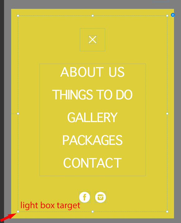
The fixed width light box target causes the light box to overlap the page/breakpoint width at
...
 6
Replies
6
6
Replies
6
Copy link to clipboard
Copied
Could you give us a small .muse file showing this issue? Can’t reproduce it here.
Upload a sample .muse file to Dropbox or a similar file sharing service and post the download link here. Then we will have a look.
Copy link to clipboard
Copied
where is the dropbox?
Copy link to clipboard
Copied
Dropbox is a webspace, where you can upload/download file for sharing with others: https://www.dropbox.com
You may use CC Files instead. Please have a look at this thread: https://forums.adobe.com/docs/DOC-8652
Copy link to clipboard
Copied
This is my link - Dropbox - mobile menu bug sample.muse
Copy link to clipboard
Copied
I tested your .muse file and couldn’t see the issue in no breakpoint neither in Safari nor in Chrome.
Since you are using an outdated version of Muse, I tried this version too, exported the HTML data and tried again – no issue visible.
Nevertheless there is a layout issue:
Are you aware, that the light box target (not the container(!)) is set to fixed width? It should be responsive width in this situation:

The fixed width light box target causes the light box to overlap the page/breakpoint width at a certain moment and causes additionally the content elements of the light box (close button, text box) to be pinned to the left and stay fixed width:

If you set the light box target to responsive width, the content elements will be responsive and unpinned too.
(Please note: It is sometimes a problem in muse to nest fixed width and responsive elements. Therefore I recommend to keep the content of the light box responsive as the target area is.)
Additionally I’d recommend to update to the newest and last version of Muse (2018.1), which solves some issues related to light boxes.
And: Please delete the 320 responsive width breakpoint. What should it effect? The minimal page width is 320 px too. So responsive movement below this isn’t possible.
Here a – hopefully  – working version of your site without breakpoints: https://www.dropbox.com/s/glla2zbk7nipg3v/mobile%20menu%20bug%20sample_Mod.muse?dl=0
Copy link to clipboard
Copied
Sorry for late reply, Thank you very much for the help, bug is fixed
 AdChoices