 Adobe Community
- Home
- Premiere Pro
- Discussions
- Dull Colors in the Creative Cloud Libraries Panel
- Dull Colors in the Creative Cloud Libraries Panel

Copy link to clipboard
Copied
Hi gang,
I have a practice of creating a library of color swatches for each of my clients. I then add it to my Creative Cloud library and can use it across Illustrator, AE, Premiere etc.
I am perplexed, however, by how these swatches show up in Premiere. Not only are they dull and therefore not a reflection of the color but there is also no way to copy the HEX code. So, they are just a tease. The heck? Am I missing something? The swatch colors display fine in any other app.

I made this library in Illustrator in an RGB colorspace.
Premiere Pro Version 13.0
Windows 10
Many thanks,
Ari


 1 Correct answer

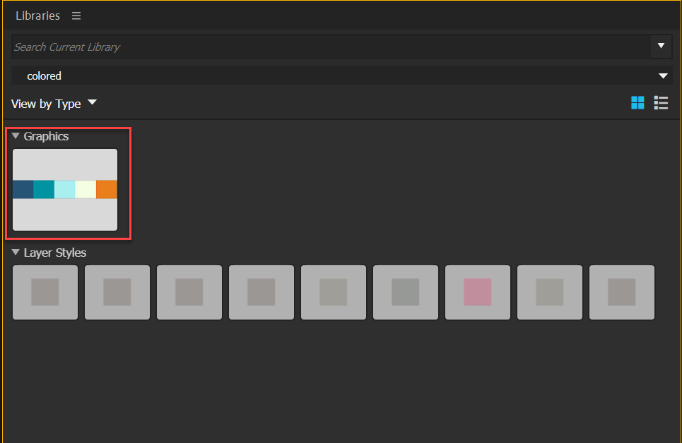
They are dull because they are not active. This is not a bug but by design.
If you want to use colors from Ps you will have to make them into a Graphic. Those will show and can be selected by the eyedropper.
 6
Replies
6
6
Replies
6
Copy link to clipboard
Copied
Also no difference is made when I adjust the appearance of the UI. Lighter focus buttons etc.
Copy link to clipboard
Copied
They are dull because they are not active. This is not a bug but by design.
If you want to use colors from Ps you will have to make them into a Graphic. Those will show and can be selected by the eyedropper.

Copy link to clipboard
Copied
Thanks for the quick reply Ann.
I used to create graphics such as the one you referenced but the swatch cc library is better and more streamlined IMO and works across systems/ users and can be updated etc. So, why exactly do they choose it to be dull like this in Premiere (whereas it does not appear as such anywhere else)? Can you please explain what you mean by "not active"?
Thanks!
Copy link to clipboard
Copied
Not active: as they do not show the full color in Pr.
They did a few versions back, but Adobe changed that.
Copy link to clipboard
Copied
https://forums.adobe.com/people/Ann+Bens wrote
Not active: as they do not show the full color in Pr.
They did a few versions back, but Adobe changed that.
Still not entirely sure what that means or why that decision was made. Surely you agree that showing true colours would make more sense? I will fill out a wish request.

Copy link to clipboard
Copied
I agree. It should not be by design because that means it is a design flaw, as it does't work the best way for people to use them. This is a terrible UI design. It adds another step in creative process. You make a color scheme for a project, then you have to turn every color in you color scheme as a "graphic" to work in premiere? Ridiculous.

 AdChoices