 Adobe Community
- Home
- Stock Contributors
- Discussions
- I got a "no, thanks", too "much artifacts". What i...
- I got a "no, thanks", too "much artifacts". What i...

Copy link to clipboard
Copied


 2 Correct answers

Looks like a fair bit of color noise and as noted above, some chromatic aberrations. Lightroom is really good at dealing with both of those, although you can also handle in Photoshop. If you're not accustomed to submitting images to stock agencies (apologies if you are) then looking over your entire image at 100% is important.
Avoiding both in camera is often the best option but I don't see any EXIF data in your posted image, so I can only guess about ISO, exposure and lens.
It's completely unrela
...
Ignore Jason's comment. He doesn't know what he's talking about.
Here's what the last two posters are referring to

See the red and green? That's chromatic aberration. Get rid of it with a click in Lightroom.
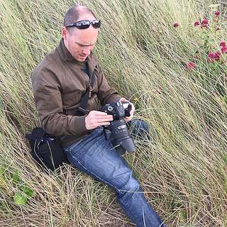
Jo has a point that the commercial value of this image isn't that great. And the lighting is bad because your camera exposed for the overcast sky and not for the flowers (?) themselves. Get off auto mode and start using manual to learn about controlling metering. This could probably have used
... 4
Replies
4
4
Replies
4

Copy link to clipboard
Copied
Nothing; just adobe doesn't know how to evaluate an image all that well.

Copy link to clipboard
Copied
Perhaps you can do something in regard to noise. I also see some chromatic aberrations.
Copy link to clipboard
Copied
Looks like a fair bit of color noise and as noted above, some chromatic aberrations. Lightroom is really good at dealing with both of those, although you can also handle in Photoshop. If you're not accustomed to submitting images to stock agencies (apologies if you are) then looking over your entire image at 100% is important.
Avoiding both in camera is often the best option but I don't see any EXIF data in your posted image, so I can only guess about ISO, exposure and lens.
It's completely unrelated to your question, and nothing to do with this rejection reason, but another thing to consider is that an image like this might be hard for a designer to use as there's not really much copy space given all the "busy" elements of the small branches (in focus or blurry). Stock images tend to sell best when they're easy for a designer to incorporate into a project. Hope this helps
Copy link to clipboard
Copied
Ignore Jason's comment. He doesn't know what he's talking about.
Here's what the last two posters are referring to
See the red and green? That's chromatic aberration. Get rid of it with a click in Lightroom.
Jo has a point that the commercial value of this image isn't that great. And the lighting is bad because your camera exposed for the overcast sky and not for the flowers (?) themselves. Get off auto mode and start using manual to learn about controlling metering. This could probably have used a flash to get it right.
Personally, I would forget this image and use the rejection as a learning experience.
 AdChoices