 Adobe Community
- Home
- Muse (read-only)
- Discussions
- best way to make a muse-site for mobile, tab and d...
- best way to make a muse-site for mobile, tab and d...

Copy link to clipboard
Copied
Hello, i want to make a clear website and when possible with a little new design...
I'd like the scroll effects, but when i make it for more screen sizes, i have to use breakpoints..which are not allowing scroll effects..
so just building a "simple"site without nice effects.
sometimes, i think back at the old muse with phone/tablet and desktop modes..
i think that was easier....now i'm making them with breakpoints and sometimes there are 8 differents, and still not everything works perfect,..
is there a way, to make a site, where there is a combination on a phone and tablet page, and for the desktop with some breakpoints?
Maybe i am wrong, but then the phone version, is scaled for each screen sizes of phone and i can still use scrolleffects? because the site detects the device.
And it is less work, then the 4 or 5 breakpoints pages i make for each phone size..
Sometimes, i'm a little bit jealous of the wordpress themes...were it is just placing text and images...and wordpress takes care of the responsive..
all through i know that it is less creative.
I hope someone has a good workaround, to build websites in muse..
i'd like to have the same building process for different sites..
grt carti


 1 Correct answer

Please take the time and look at these videos: https://helpx.adobe.com/de/muse/tutorials.html
You hardly can expect, that we repeat here all these guidelines.
And: If you liked the way, the older Muse versions worked, go to menu "Page/Add Alternate Layouts" and you have the same behavious as in former times.
BTW: Adding breakpoints according the size of device screens is a very poor idea! Add breakpoints, when the design starts to fall into pieces.
 12
Replies
12
12
Replies
12
Copy link to clipboard
Copied
Please take the time and look at these videos: https://helpx.adobe.com/de/muse/tutorials.html
You hardly can expect, that we repeat here all these guidelines.
And: If you liked the way, the older Muse versions worked, go to menu "Page/Add Alternate Layouts" and you have the same behavious as in former times.
BTW: Adding breakpoints according the size of device screens is a very poor idea! Add breakpoints, when the design starts to fall into pieces.

Copy link to clipboard
Copied
Günter Heißenbüttel написал(а):
BTW: Adding breakpoints according the size of device screens is a very poor idea! Add breakpoints, when the design starts to fall into pieces.
You are not right. This depends on the approach.
cartimundi, best practice here Muse Jam: Fixed Breakpoint Responsive Design - YouTube .
My example: 1200 fix, 960 fix, 768 fix, 768 fluid with min width 320.
Copy link to clipboard
Copied
thanks a lot, i'm gonna watch it..
from now i'm thinking about fixed size for mobile and tablet and breakpoint for desktop 800 (x600) 1366(x768) , 1920 (x1080) and bigger
Copy link to clipboard
Copied
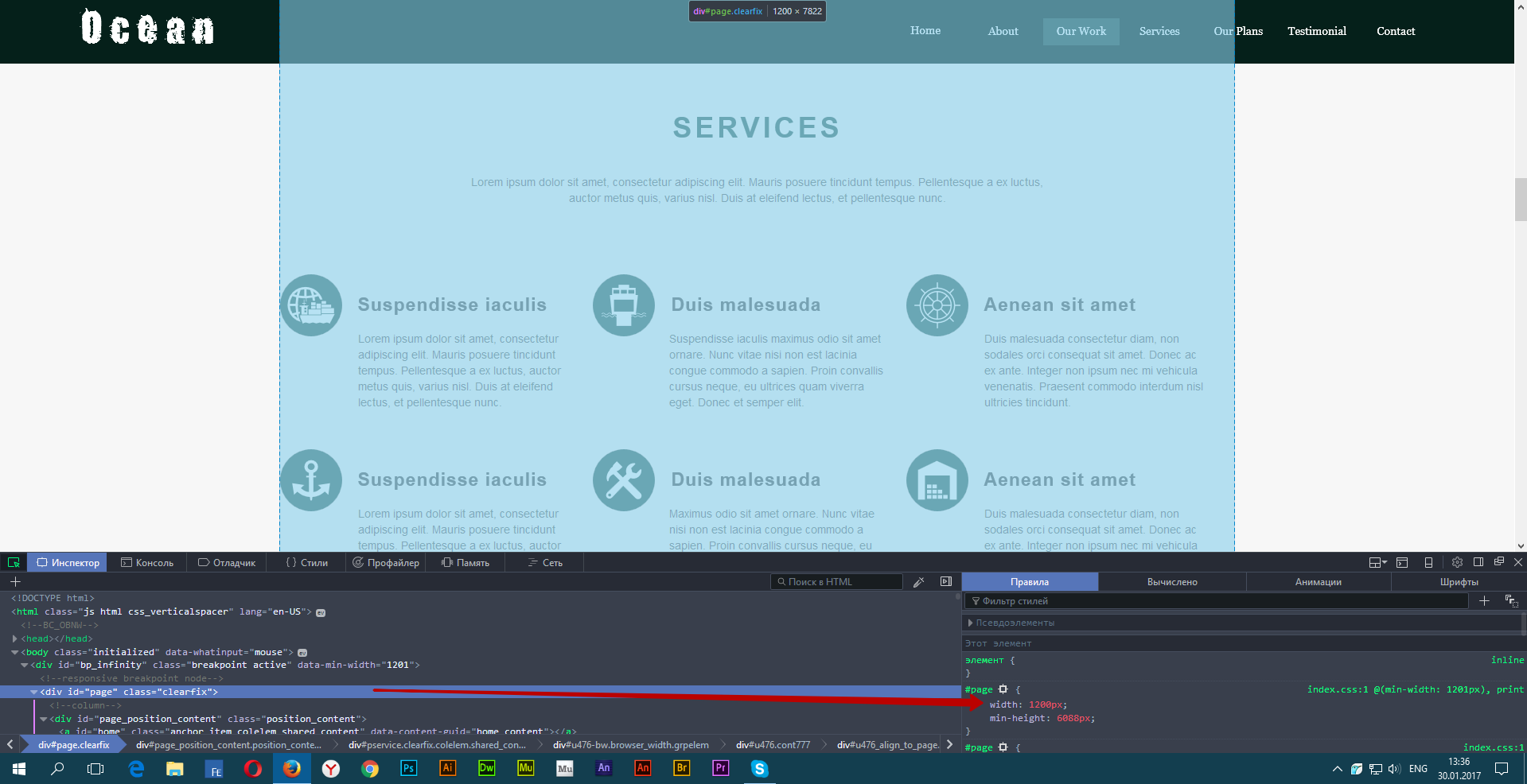
In most cases, enough 1200 pixels as the biggest breakpoint. Should be used as little as possible the number of breakpoints that the site will be fast and not buggy. Look at my example site on the screen of 1920 pixels. You should be obvious that 1200 pixels is enough.
Copy link to clipboard
Copied
how can i make a page with a fluid breakpoint and fixed breakpoint at 768??
and is the 1200 point a fixed point?
Copy link to clipboard
Copied
First you create 768 fixed width , then create 768 fluid width.
Copy link to clipboard
Copied
If it "depends on the approach", as you say Pavel Homeriki, you may be as right as I am! 
There is no necessity to introduce a new breakpoint, if there aren’t elements, with don’t display as expected.
Copy link to clipboard
Copied
Perhaps I spoke too orthodox. You are right in that case if you are using a fluid break point, but not right when using the fixed breakpoints.
Copy link to clipboard
Copied
Yes. Now I understand! In this case, you are right!
Copy link to clipboard
Copied
thanks!
Copy link to clipboard
Copied
why are you using images in this way...
there are 2 ways, i don't know what the best is...
- paste an image
or paste a box and fill it with an image...
.( i thought this is/was the best, because you can set settings to the inner image, like center to the right, left or middle, true size or scale to fit ( i hope you understand what i'm saying, i don't know the exactly english commands...i'm working with a dutch one..)
Copy link to clipboard
Copied
It's simple. If the image is filled in the box, it's useless for SEO.
 AdChoices