 Adobe Community
- Home
- Muse (read-only)
- Discussions
- Textalignment in responsive Site jumps around
- Textalignment in responsive Site jumps around

Copy link to clipboard
Copied
Hi,
although I have a paragraph style set to text in landing page: Dropbox - kindgenau_2017.muse
it jumps around between different breakpoints. I tried also to set it between different breakpoints but of course it changes all
line breaking for all breakpoints, so setting it in the 960 BP changes also at 1340 and 1900 (maybe).


Another issue: I think I attached the text layer very correct exactly towards the left / red column, uploaded it is just one pixel inside the red column.

Because I was not able (without two hours of additional copy and paste - no set to original place did not help at all), I attached the whole muse-file.
Help is needed only for the landing page. It stops at 960 px (the other layouts will follow later).
Thanks in advance


 1 Correct answer

1. The text does exactly, what you told him to do: To much "Returns", adventurously defined margins and indent. All together a fine mixture of chaos! 
2. The slight misalignment of the boxes: These probably are (unavoidable) mathematical rounding errors. But it is your decision to stick perseveringly to this layout with 2 unequal layout columns. But I told you already …
In this case you easily can fix this issue by putting the vertical right menu strip on top of all other elements.
3. The 3 coloure
... 3
Replies
3
3
Replies
3
Copy link to clipboard
Copied
1. The text does exactly, what you told him to do: To much "Returns", adventurously defined margins and indent. All together a fine mixture of chaos! 

2. The slight misalignment of the boxes: These probably are (unavoidable) mathematical rounding errors. But it is your decision to stick perseveringly to this layout with 2 unequal layout columns. But I told you already …
In this case you easily can fix this issue by putting the vertical right menu strip on top of all other elements.
3. The 3 coloured text boxes will give you much joy when it comes to responsive. Just look in my sample file, what they do, when you minimise your browser window.
4. In the example site https://dl.dropboxusercontent.com/u/7046655/kindgenau_2017_Mod.muse I show you a better working alternative. Just try to figure out, how it is done!
Copy link to clipboard
Copied
I really wanted to give it a try with these two unequal columns. I understand now so much more.
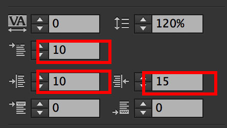
Thanks for the text alignment issue-solution. To be honest, I didn`t really know what the first line indent does or did
but I understand, to better avoid this.
The three colored text boxes: yes, when it comes to small screens it gets weird, frankly speaking.
That`s the reason I want to change from 960 px to another layout.
Also I really like the proposal of using a complete colored box as background for text. This makes it more safe.
Great
Uwe
Copy link to clipboard
Copied
fotoroeder schrieb:
Thanks for the text alignment issue-solution. To be honest, I didn`t really know what the first line indent does or did
but I understand, to better avoid this.
No, it is not better to avoid, it is better to understand!

 AdChoices