 Adobe Community
- Home
- Muse (read-only)
- Discussions
- Diagonal scrolling towards anchors on a one-page w...
- Diagonal scrolling towards anchors on a one-page w...

Copy link to clipboard
Copied
I'm creating a one-page website but I'm having some troubles with the anchors. When I make the browser smaller to check if my breakpoints work there is something wrong that I can't find a fix for.
When i click on the menu to go towards an anchor, the website moves the page to the right.

The only working answer for this problem that I found online does not work for me. You have to set your anchor to side of the browser.

As you can see I'm sure the anchor is on the right place. I've tried so many things to fix it but it seems like I'm not able to find the answer.


 1 Correct answer

There are different glitches on your site:
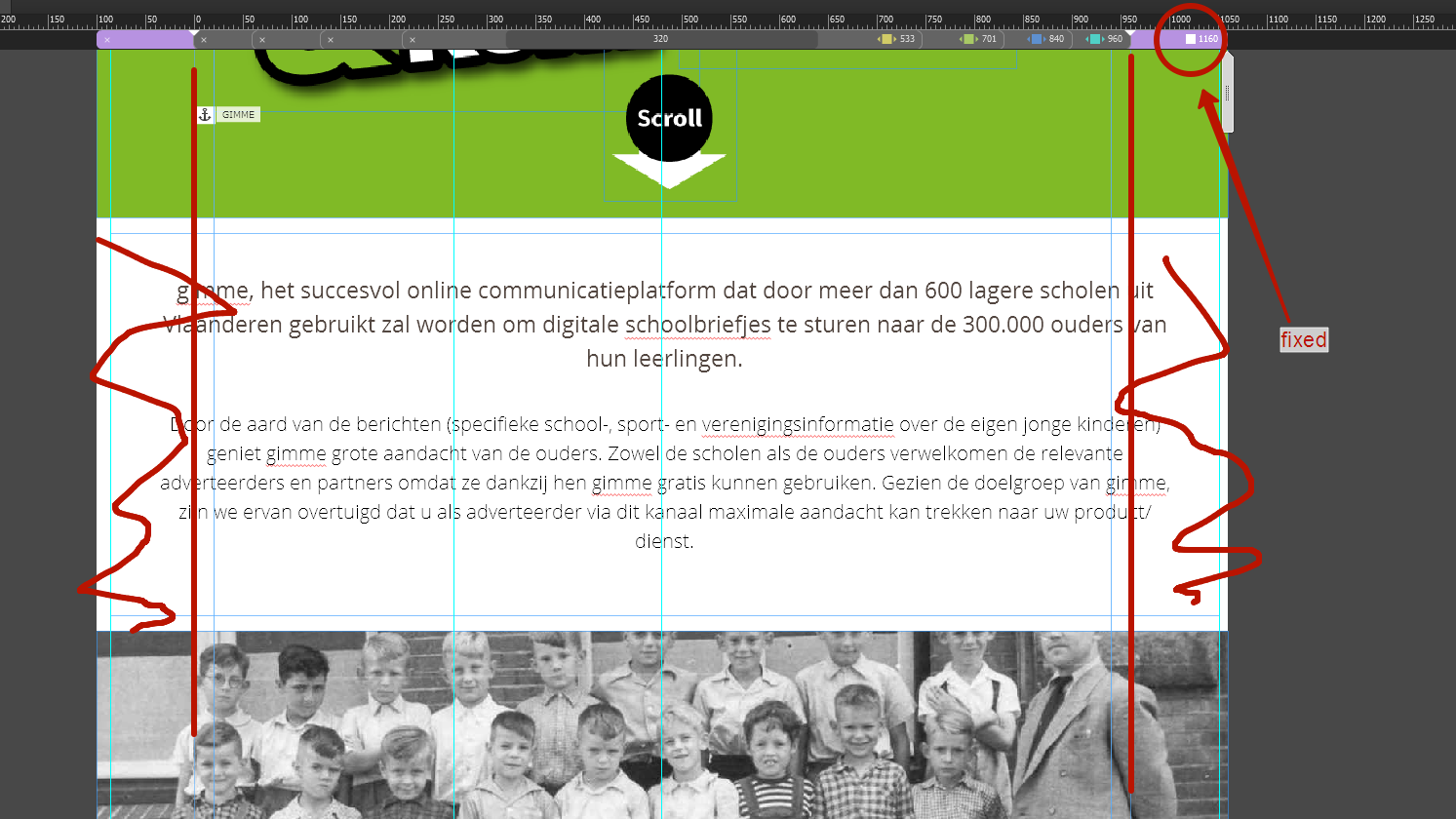
1. Believe it or not: There is a misplaced anchor!  You can’t see this, because this anchor is hidden behind other elements.
I am talking about the anchor „HOME“. Just do the following:
- Select the anchor „GIMME“.
- Rightclick onto it and choose „Select same (anchor)“
- Now select the „Align“ command in the upper control strip, choose „Align to content area“ and click onto the „Align left edges“ icon.
- Repeat this for every breakpoint.
- Now all anchors are placed co
 10
Replies
10
10
Replies
10

Copy link to clipboard
Copied
Copy link to clipboard
Copied
I checked my whole file and did not find any boxes like this.
Copy link to clipboard
Copied
And where on your page are the anchors placed?
Copy link to clipboard
Copied


Copy link to clipboard
Copied
In this case, we should have a look at the .muse file (-> Dropbox or a similar service).
Copy link to clipboard
Copied
There you go. Sorry for the delayed answer.
Copy link to clipboard
Copied
If you are using a fixed break point, outside the page should not be objects, except 100% width of blocks.
If you are using fluid breakpoint, outside the page should not be objects, even between breakpoints. 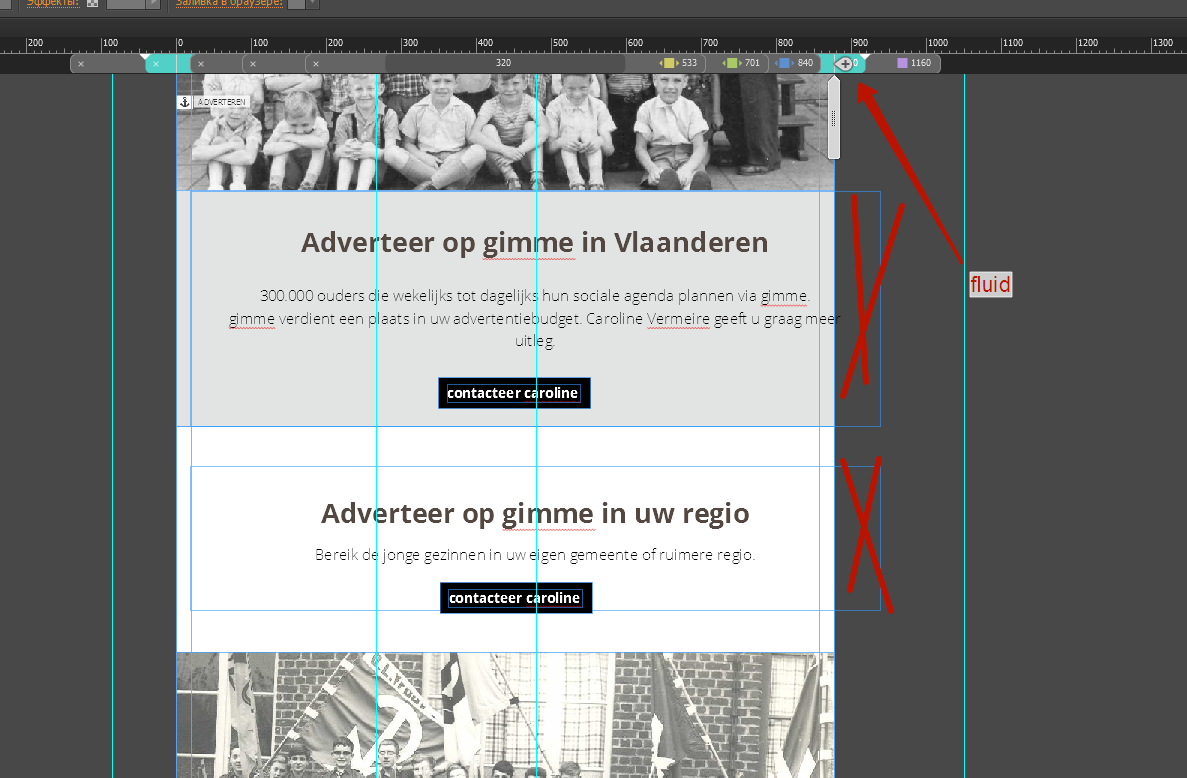
Copy link to clipboard
Copied
There are different glitches on your site:
1. Believe it or not: There is a misplaced anchor!  You can’t see this, because this anchor is hidden behind other elements.
I am talking about the anchor „HOME“. Just do the following:
- Select the anchor „GIMME“.
- Rightclick onto it and choose „Select same (anchor)“
- Now select the „Align“ command in the upper control strip, choose „Align to content area“ and click onto the „Align left edges“ icon.
- Repeat this for every breakpoint.
- Now all anchors are placed correctly to the left edge of your page/breakpoints.
2. The logo in your header is pinned to the center. I’d pin it to the left. The menu should be better pinned to the right. (In all breakpoints!). So these elements don’t run out of the breakpoint area, when you resize the browser window
3. Many of your text boxes don’t scale, and therefore they run out of the page area, when the browser window is scaled. (You can observe this, when you zoom out, so that you can see the whole page, and drag the „scrubber“ slowly to the left.) Make these boxes resizing „responsive width“.
Try these suggestions and ask again, if you meet other issues. In this case, provide a new .muse file.
Copy link to clipboard
Copied
You are a hero. Thank you so much!
Copy link to clipboard
Copied
"You are a hero." -> Would you please tell this to my wife and daughter?
I told them hundred times – they didn’t believe!
And: Please have a very close look at the contribution of Pavel Homeriki! He is absolutely right!
 AdChoices