 Adobe Community
- Home
- Muse (read-only)
- Discussions
- responsive resizing of overlapping objects
- responsive resizing of overlapping objects

Copy link to clipboard
Copied
Here's what I'm trying to do. I have an image filling the browser window. I want to put images on top of that but with a white rectangle behind them that has a transparency applied to it so the browser fill image is slightly visible through the rectangle but keeping the image on top within the white rectangle so the browser image doesn't interfere with the top image. So far, I have that, but the two rectangles (white and top image) are not the same proportions (e.g., a long rectangle with a square on top), so when the browser window gets smaller, the image on top starts to bleed off the bottom of the white rectangle behind it. There's also a text box next to the image describing the image. I understand text doesn't resize, but is there a way to get the image and the backing rectangle to resize as a single item so the square stays in the same position and proportional size with the rectangle (so the top image stays completely within the white rectangle)? I tried grouping them, but that didn't have any effect.
Muse 2017.1
Mac OS 10.12.6
iMac 27" late 2015


 1 Correct answer

Now I see.
You encountered a glitch, which fortunately is easy to fix:
You have set the white rectangle to 80% opacity, using the command in the upper control strip:
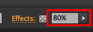
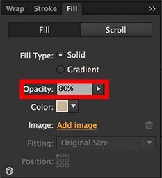
Set this value back to 100 % again and use the „Fill“ panel instead, to set the opacity value to 80 %:
Now all should work fine!
I reported this issue to the Muse team.
 12
Replies
12
12
Replies
12
Copy link to clipboard
Copied
Please give us a .muse file, containing only one page, and only the elements, you talked about in your initial posting (please no complete site, please not tons of elements and images). Just follow these instructions: https://forums.adobe.com/docs/DOC-8652
Copy link to clipboard
Copied
(the link changed to "Adobe Creative Cloud" when I clicked away from it, but I assume it's still there)
I should say that I am a print designer and do very little with websites and have used Muse very little, so there may be better ways to do what I envision, or it may not be possible. Also, I achieved a bit of what I had in mind by making changes at break points, but the images of the paintings still start to dip below the backing white rectangle as the width of the browser decreases, and I would prefer a smooth transition, if possible.
Copy link to clipboard
Copied
Set the semitransparent, white rectangles to „Responsive Width“, not „Responsive Width and Height“.
If you force these rectangles to scale proportionally (= responsive width and height), they evidently shrink proportionally, if you minimise your browser window, while the text elements grow, because its shrinking width causes it to grow verically in order to keep showing the complete text content.
If you set a rectangle to responsive width only, the rectangle adapts the size of the objects, which are placed „into“ it.
Copy link to clipboard
Copied
Hi Günter,
I tried that but because the painting image is not placed into the semitransparent white rectangle, they don't resize together. If I place it into that rectangle—if that rectangle becomes the frame for the image, the image takes on the transparency. Is there a way to put them together so the white rectangle is transparent but the image it contains is not?
Copy link to clipboard
Copied
If I say "into" I don't mean to fill the rectangle. I mean: Placing element on/in a rectangle, which is set to "scale horizontally", the underlying rectangle scsles according to the elements, which are placed into/onto it.
Just try it: Place a rectangle and place text or an image within the area of the first rectangle (no filling, no grouping). If you resize the browser window, you will see, that the rectangle resizes according to the resizing of the elements within.
Copy link to clipboard
Copied
Thanks for clarifying "into" but as far as I can tell, the white rectangles just scale independent of what's placed over them. I changed the scaling to horizontal only and removed the images and text from the bottom rectangle, and it appears to scale the same way as the other two, just horizontally (see linked file). This does keep the vertical distance between white areas the same, which I do want. I could probably live with this, but I was hoping to get the basic layout of the white rectangle and painting image to scale together as one piece, including the placement of the image at a certain point proportionally in the upper left of the rectangle (i.e., so the distance of the image from the top and left of the white rectangle decreases proportionally too). I may be asking too much, or I may just need to insert break points and adjust the layout as needed. As a print designer, I'm accustomed to being able to get precise results that probably aren't always available in websites. Thanks for your thoughtful replies and for your patience.
Copy link to clipboard
Copied
Now I see.
You encountered a glitch, which fortunately is easy to fix:
You have set the white rectangle to 80% opacity, using the command in the upper control strip:

Set this value back to 100 % again and use the „Fill“ panel instead, to set the opacity value to 80 %:

Now all should work fine!
I reported this issue to the Muse team.
Copy link to clipboard
Copied
Well, it works better in Chrome and Firefox than in Safari, and it's not exactly what I wanted, but it's close enough to mark this as a correct answer. Thanks again for taking the time to analyze my file and the issue that was troubling me.
Copy link to clipboard
Copied
No idea, what is „exactly, what you wanted“.
Perhaps you could be a little bit more specific?
Copy link to clipboard
Copied
I was looking for a smooth transition of the entire page, basically, as if it was all a single image being resized.
Copy link to clipboard
Copied
Then reduce your breakpoints! Your layout doesn't need most of them!
Copy link to clipboard
Copied
OK, thanks for the tip. I'm really a beginner with Muse, and appreciate the help.
 AdChoices