 Adobe Community
- Home
- Muse (read-only)
- Discussions
- image browser width - in one direction only
- image browser width - in one direction only

Copy link to clipboard
Copied
I'm new to Muse and I'm basically trying to create a responsive site with the look of a two column site. At the top I want an image to stretch to browser width but only to the left - and on the right of the image is a coloured box that should stretch the browser width to the right....but I don't want to click on the double arrows in the top ruler because I don't want the entire site to stretch browser width. Hope that makes sense to someone.
any suggestions?
D


 1 Correct answer

1) Place two rectangles.
2) Create two graphic styles:
- for the left rectangle with name objectpos
- for the right rectangle with name objectpos2
3) Paste the following code in page properties
<style type="text/css">
.objectpos {
position: absolute !important;
left: 0px !important;
width: 50% !important;
}
.objectpos2 {
position: absolute !important;
right: 0px !important;
margin-left: 0px !important;
margin-right: auto !important;
left: auto !important;
width: 50% !important;
}
</style>
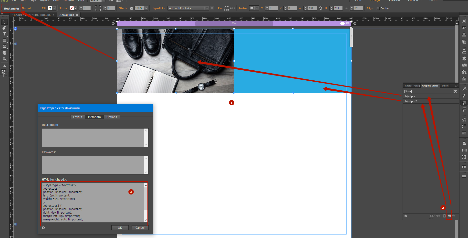
4) Place another tr
...
 2
Replies
2
2
Replies
2
Copy link to clipboard
Copied
1) Place two rectangles.
2) Create two graphic styles:
- for the left rectangle with name objectpos
- for the right rectangle with name objectpos2
3) Paste the following code in page properties
<style type="text/css">
.objectpos {
position: absolute !important;
left: 0px !important;
width: 50% !important;
}
.objectpos2 {
position: absolute !important;
right: 0px !important;
margin-left: 0px !important;
margin-right: auto !important;
left: auto !important;
width: 50% !important;
}
</style>
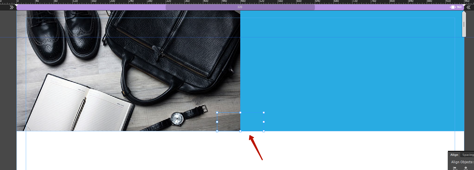
4) Place another transparent rectangle 100x40px
5) Enjoy
Copy link to clipboard
Copied
Thanks...I didn't realize there was a spot to add your own code. Still lots to learn. Thanks!
 AdChoices