Copy link to clipboard
Copied
Hey all,
I'm doing a logo design for a company. Here's a sketch of the logo:
I want to have both the white and black lines on the same weight (unlike the sketch). So when I try to vectorize it, i decided to take the middle black line, trace it until halfway down, copy and mirror it down, add white stroke, expand, add black stroke, then the rest of it.
but instead what happens is the following:
The outermost strokes always turns out to have this weird ugly angles. If i modify it at this point the monoweight line effect is gone. I tried it with 4 different line weights and it always came out wrong. I have been using illustrator for a while but somehow this type of problem avoided me.
Does anybody have any advice about this? Thanks!
This is one way to approach it.
Copy link to clipboard
Copied
This is one way to approach it.
Copy link to clipboard
Copied
wow thats a great guide, thank you for taking the time!
Copy link to clipboard
Copied
You're welcome!
Copy link to clipboard
Copied
Years ago I had a very similar task.
Needed make curvy lines and equal spacing between.
So I thought I would share my method if interested.
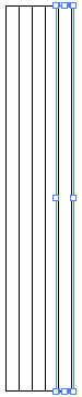
With pen tool, I made a zig zag path. Corner points.
Made and Art brush with Fill paths.
Applied Art brush to zig zag.
With the Direct Selection tool, selected the two center anchors and applied a large Round Corner. (Effect>Stylize>Round Corners).
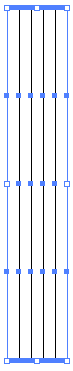
EZ edits!!! Your Art Brush, anchor points on stroke, radius on Rounded Corners.
Expanded Appearance, Expanded strokes & fills.
Next Live Paint.
Expanded Live Paint. Pathfinders>Unite.
K
Copy link to clipboard
Copied
epic, thank you! ❤️