 Adobe Community

Copy link to clipboard
Copied
I have textboxes under photo's on my site. How do I keep them together?


 1 Correct answer

Only to show, what is possible, look at this second sample file: https://www.dropbox.com/s/fh62zalx6skjdlq/Metmateman__Mod2.muse?dl=0
The whole thing is nailed together quick and dirty, but you see, what tricks are necessary, if you want to create such a site.
Generally spoken, is is very difficult to build a horizontally layouted page with small, differently scaling (horizontally, vertically, proportionally) element side by side. In this case, Muse can’t decide any more, which element should infl
... 33
Replies
33
33
Replies
33
Copy link to clipboard
Copied
Where exactly on your page?
I see one situation, where text („Webdesign door …“) flows into the red area above. Here the text moves according to the images, but not to the red area. Perhaps, because the red area is scaling horizontally and not proportionally like the images.
Another situation („bouwstudiobartoudendijk.nl“). Here the textbox runs out of center, because it seems to be fixed width and (wrongly) pinned.
The Numbers „001“, …, …) have no reference, and therefore they don’t know, what you expect themto do.
To fix this, we should have a look at your .muse file.
Please do the following: isolate one block – for example the green one –, paste it into a newly created Muse document and let us have a look at this .muse file. Please don’t simply give us your compete site! We’ll try to fix an issue, not th re-create a whole site and follow these instructions: Please Provide a .muse File to Help Us Fixing Your Issue!
Copy link to clipboard
Copied
Thank you Günter,
I have made this a year ago But I wanted to place new work, make it more professional with Muse 2017. Now there pops up a new problems:
The round buttonsmenu does not stay in line
The numbers and URL's won't stay in place
Maybe you can help me with it. I send you a small file.
Copy link to clipboard
Copied

Copy link to clipboard
Copied
I remember from earlier posts. You really do not need the breakpoint at 320 on your master.
Maybe not the solution to your issue but at least not helpfull, I guess.
This is indeed not helpfull:

Browsers try to reach the anchor.
Kind of funny, that the buttons are aligned at 1900.
And because you (maybe unintentionally) pinned elements in your composition to the left, while pinning the whole compo to the right
your issue happened.

By changing this, your buttons keep aligned.
BTW, one page would have been enough, like Pavel mentioned.
Best Regards,
Uwe
Copy link to clipboard
Copied
Thank you Uwe,
The menu is now pinned at the right, almost all the buttons behave correctly, almost all... And I don't see any difference between them.
I have removed breakpoint 320, but all the items are not positioned right. It's a mess, so I don't know any other way than to place breakpoint 320.
My first question was about keeping pictures and text boxes together. The url's I want them close to the pictures. Is that possible.
It is driving me nuts.
What about Pavel, he means there are to many items on one page? I have to make more pages
Copy link to clipboard
Copied
For us in the forum, it is much faster to only watch at one page which needs assistance.
In your case you gave us three pages but only one page with the buttons that needed correction.
If you need help with text and pictures give us just the one page with your issue/question.
We don´t have to and don`t want to and don`t have the time to investigate where to look at.
Best Regards,
Uwe
Copy link to clipboard
Copied
Sorry for that.
I am going to search for someone who wants to build this site for me (paid). There are to many issues, and it takes to a lot of time to solve them (also yours). Maybe I want something that is not suitable for Muse (keeping text and pictures together, why is that so difficult).
Thanks for your help.
Kind regards, Regine
Copy link to clipboard
Copied
Come on, don`t give up. Give us one page, on text layer and one picture and tell us what you want to achieve.
Head up …  .
.
Uwe
Copy link to clipboard
Copied
Dropbox - Metmateman_2017-test.muse
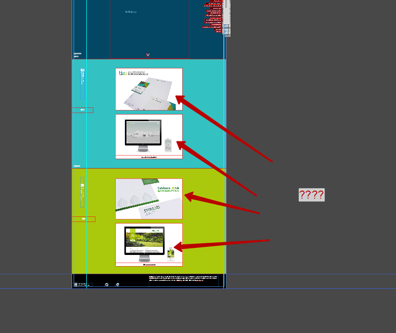
Here is a link with one page, I also send you 2 jpg's. On the jpg's you can see what I want.
1 The logo left, same height as the picture
2 the number x-height bottomline first picture
3 the url's text boxes stick to the picture, no white space
thank you for your patience.


Copy link to clipboard
Copied
We really can’t answer, if you don’t give us a .muse file! You’ve already lost one day by not following our recommendation.
Please re-read my post 1 in this thread and give us a file with one(!) „misbehaving“ sample section as I already told. Please don’t give us the complete site, only a small section, showing your issues.
Copy link to clipboard
Copied
Hello Günter,
I send Uwe also the link and explanation, maybe you want to take a look?
Thank you.

Dropbox - Metmateman_2017-test.muse
Here is a link with one page, I also send you 2 jpg's. On the jpg's you can see what I want.
1 The logo left, same height as the picture
2 the number x-height bottomline first picture
3 the url's text boxes stick to the picture, no white space
thank you for your patience.
Copy link to clipboard
Copied
Even this little page works very badly and slowly.
1) Use a composition with 14 triggers instead of 14 compositions. Or it is better to give up the use of the compositions and use states buttons. 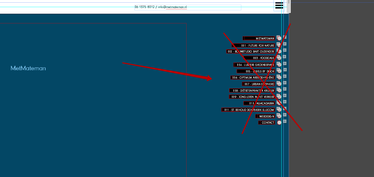
2) Why do you use a slideshow? What's the point?
These two points make your page very heavy and slow.
3) The rest of your questions can be solved by a significant restructuring of the site. Do not use a flexible layout. Use a fixed layout and fixed breakpoints. A flexible breakpoint is sufficient for only one 768.
You will not be able to fix all of your problems at flexible breakpoints.
Copy link to clipboard
Copied
Thank you Pavel,
I had this site but I wanted to make a more professional site, so I build a new one. I ask for help and they suggested I should use slideshows instead of normal picture boxes. So I did. Now I am confused of all the different opinions.
Copy link to clipboard
Copied
Maybe you did not understand correctly what were recommended to you. I do not see any sense in using slideshows in the way in which they are used now. Only harm. When working in Muse, especially when working with responsive design, you should avoid using widgets if possible and especially such widgets as slideshow and composition. Especially if their use is not justified. These widgets are very heavy. A lot of their concentration on the page leads to brakes.
Copy link to clipboard
Copied
Regine43b, just have a close look at this .muse file – a modified scetched version of your page. I think this works as you are expecting: https://www.dropbox.com/s/0jm47ykiqqt817c/Metmateman_Mod.muse?dl=0
Copy link to clipboard
Copied
Hello Günter, It looks very good! And it has only one breakpoint. I am going to try it this way.
At the smallest size the numbers are to large, is there a manner to solve that?
I only need one breakpoint at 960?
Thank you!
Copy link to clipboard
Copied
My sample only has one breakpoint, because I didn’t want to rebuild your complete site! 
Just look, how many breaks you need. I suggest, to add more breakpoints, when one is (nearly) ready.
You can change font attributes like size and colour (not the wording) by using this tool bar command:

Copy link to clipboard
Copied
I build the homepage again, your test site was the example. Did it the same way, but my site behaves in a different way than yours. At your site the pictures and text stay together.
Kind regards,
Regine
Copy link to clipboard
Copied
Hello Pavel,
Maybe you want to take a look at this site, I used fixed breakpoints now.
Do you have a suggestion to make it more professional?
kind regards
Copy link to clipboard
Copied
I used fixed breakpoints now.
Hi. I do not see that you use fixed breakpoints. These are still responsive breakpoints and the site is very heavy.
If you plan to constantly add new work to one page, your site will soon cease to open due to large performance problems.
As for my opinion, I would make such a site in Joomla, but not in Muse.
Copy link to clipboard
Copied
Pavel, Wil you delete my post?

Copy link to clipboard
Copied
Regine43b wrote
Pavel, Wil you delete my post?
The forum policy is to not delete posts that have been answered because your questions could benefit other users.
Alt-Web Design & Publishing ~ Web : Print : Graphics : Media
Copy link to clipboard
Copied
Please don’t remove this thread! Nobody has a right of ownership of a thread in a public(!) forum — especially, when the initial post already already got answers and statements. I think, it would be more than unpolite in regard to other contributors to delete their posts. Additionally there might be valuable informations for other community members.
It would be quite annoying, if someone contributes to a conversation and has to fear, that her/his statements may be removed, when the thread opener got his answer or looses interest in the discussed subject. If this would be common practice, it definitely would be the end of user communities.
Copy link to clipboard
Copied
The OP has been advised to change her screen name.
Deleting all of her old posts is not an option as it would create too many problems with forum search results.
Alt-Web Design & Publishing ~ Web : Print : Graphics : Media
-
- 1
- 2
 AdChoices